Alexandrine Allard // Product Designer, Manager

National Bank of Canada. Redesigning a bank portal.

In 2017, I worked closely with the National Bank of Canada to redesign their entire online banking portal. This redesign earned the Web & App award of the Grand Prix Boomerangs in 2018.

Role: UX Researcher and design
Platform: Web

 
Screen+Shot+2020-08-04+at+2.56.12+PM.jpg
 
Logo.png

In order to attract a different segment of users, National Bank of Canada had to rethink the way they were seen. For the Bank to attract young professionals, they mandated a team of product expert that were able to rethink their branding, their narrative and their online platform.

Have a look at the marketing video we created when the project was delivered:


Login page from 2003

Login page redesign in 2017

The National Bank of Canada’s online portal was first created in 2003 and has not been rethought since then. Working along with their internal team of UX and UI designers, developers, data analysts and product managers, we delivered an entirely new web platform in 18 months - including 1580 interface designs and 65 user tests.

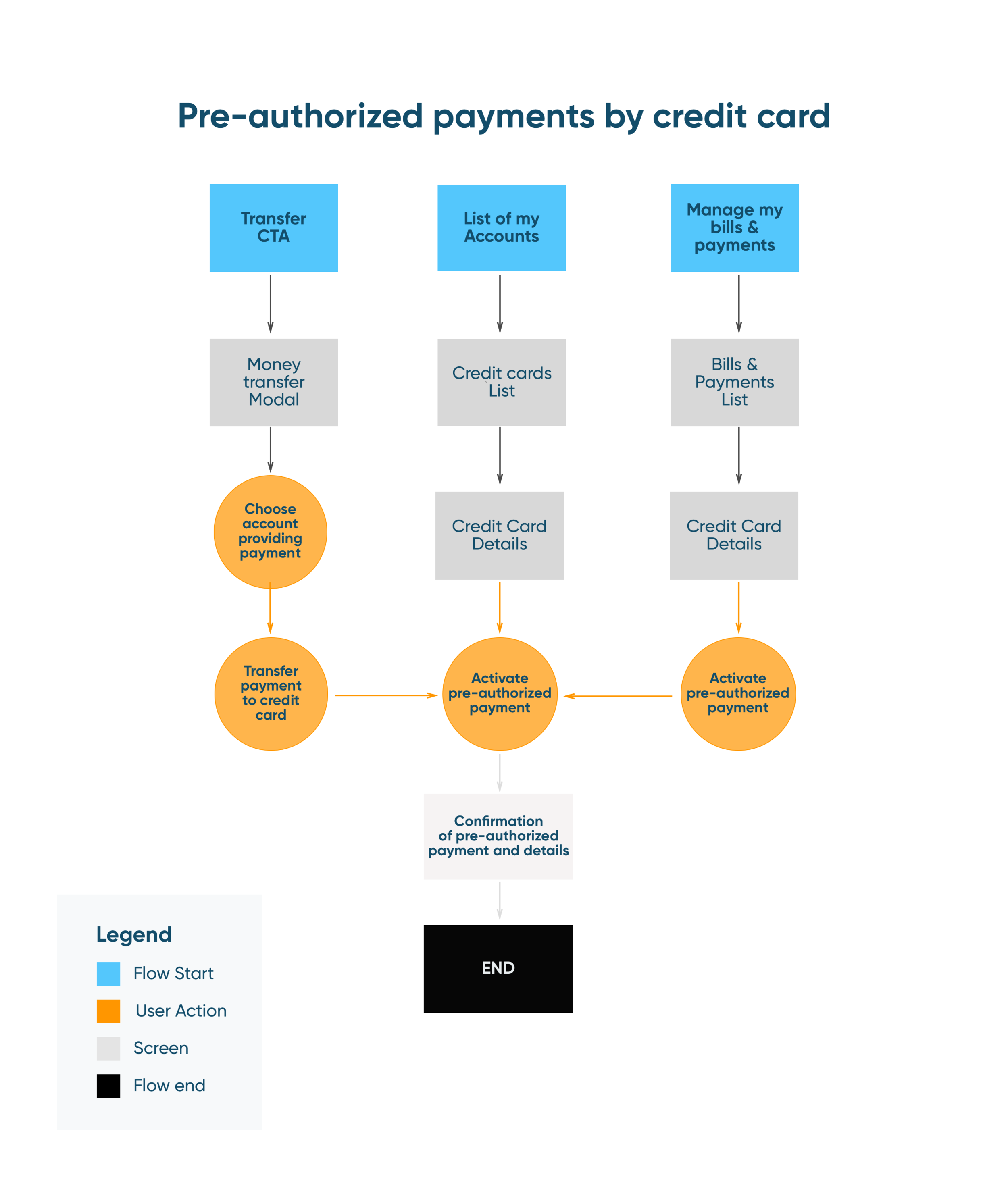
Rethinking NBC user flows

Rethinking NBC user flows

User flow deliverable for approval by bank analysts

User flow deliverable for approval by bank analysts


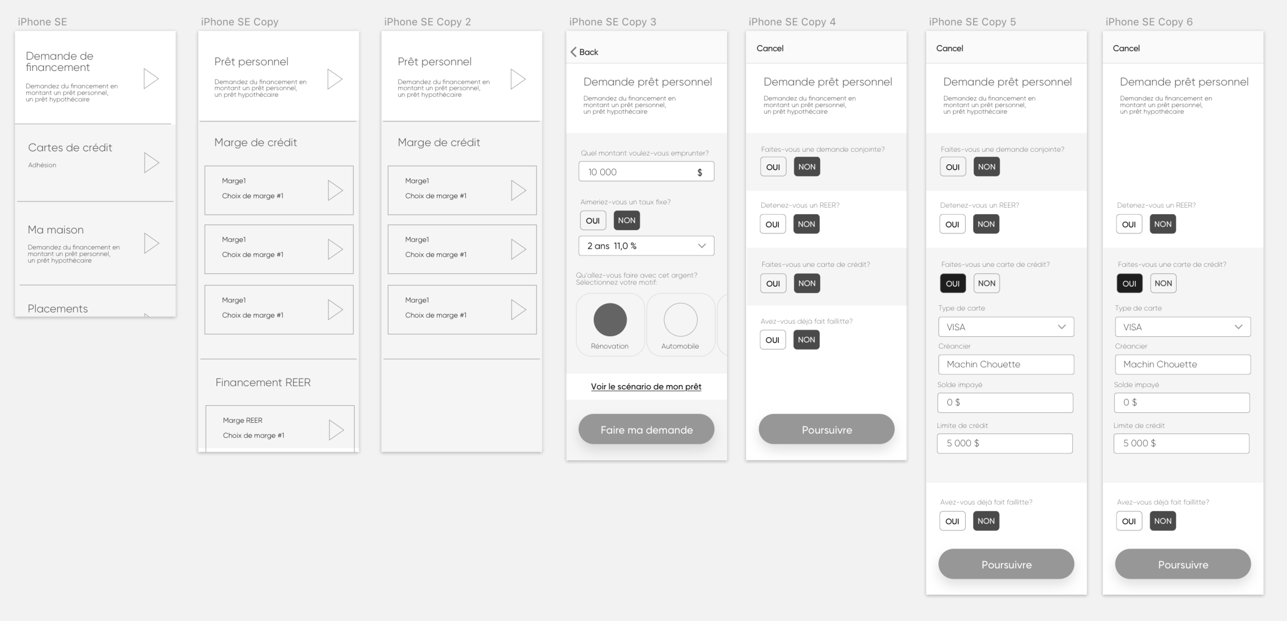
UX wireframes iterations

UX wireframes iterations

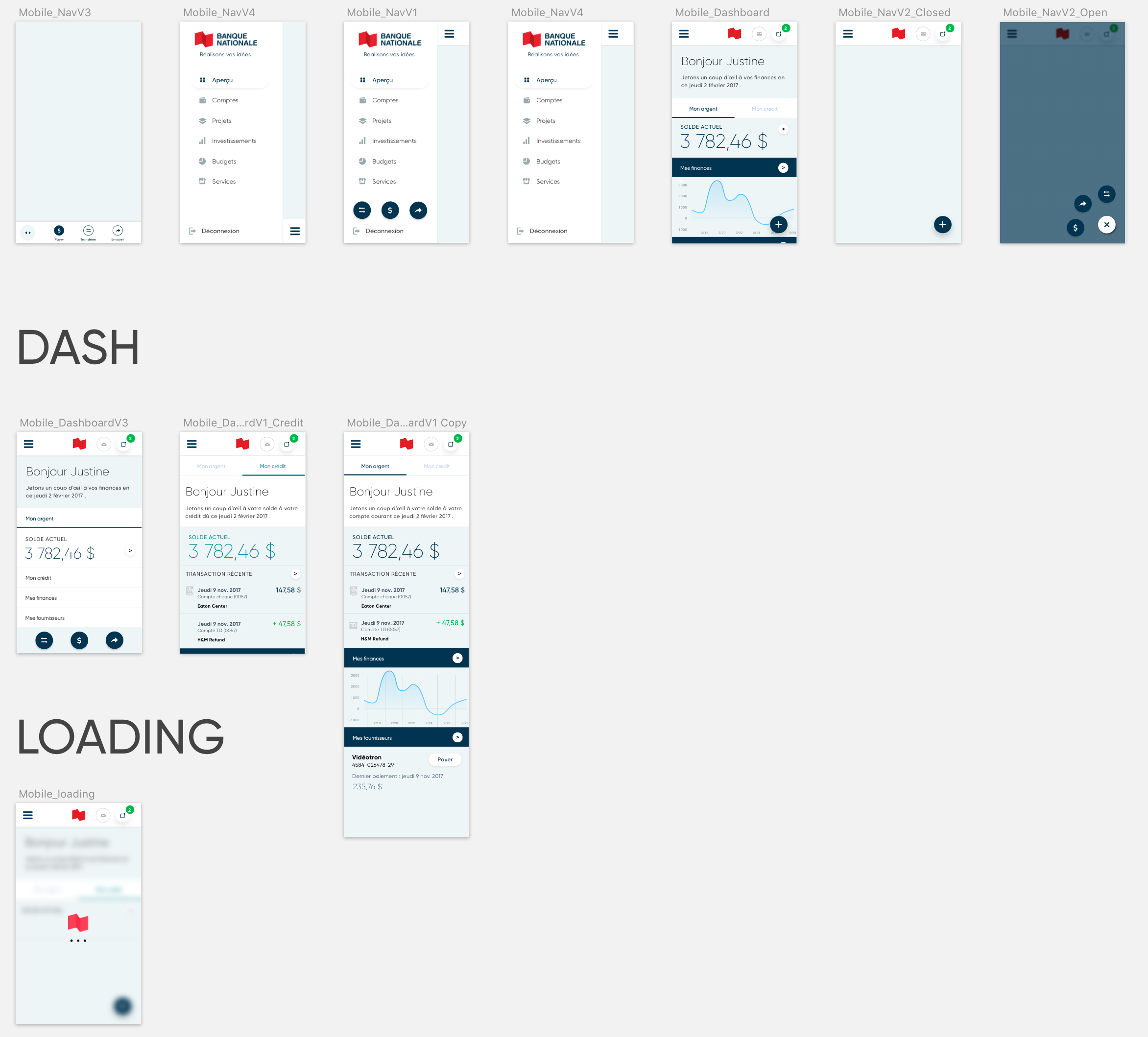
To more polished UI iterations

To more polished UI iterations


Transaction list

Account overview, open sidebar selection


Bill payment

Success message


Along with redesigning the banking portal for existing clients, the redesign challenged us to review account opening at National Bank of Canada. Today, you have the freedom to open a new bank account, of any type, in a secure and guided way online.

Opening a new bank account

Interested in seeing the platform live?
Access the final result


GOLO. Every day items, right to your door.

From 2014 to 2016, I worked as a Product Designer at FANS Entertainment, a startup that was later bought by Paysafe (2016).

In 2015, we created GOLO - a mobile ordering platform, delivering local goods directly to customers’ doors.

Role: UX Researcher, UX Designer and UI Designer
Platform: Web, Android and iOS

 
photo-1429681601148-75510b2cef43Test_.png
 
32253691_1724704250930204_2602989024507330560_n.jpg

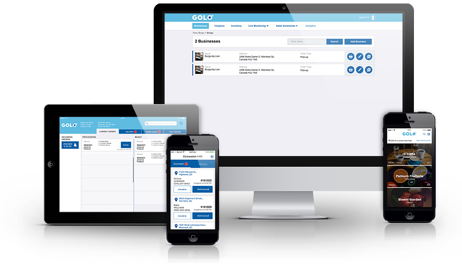
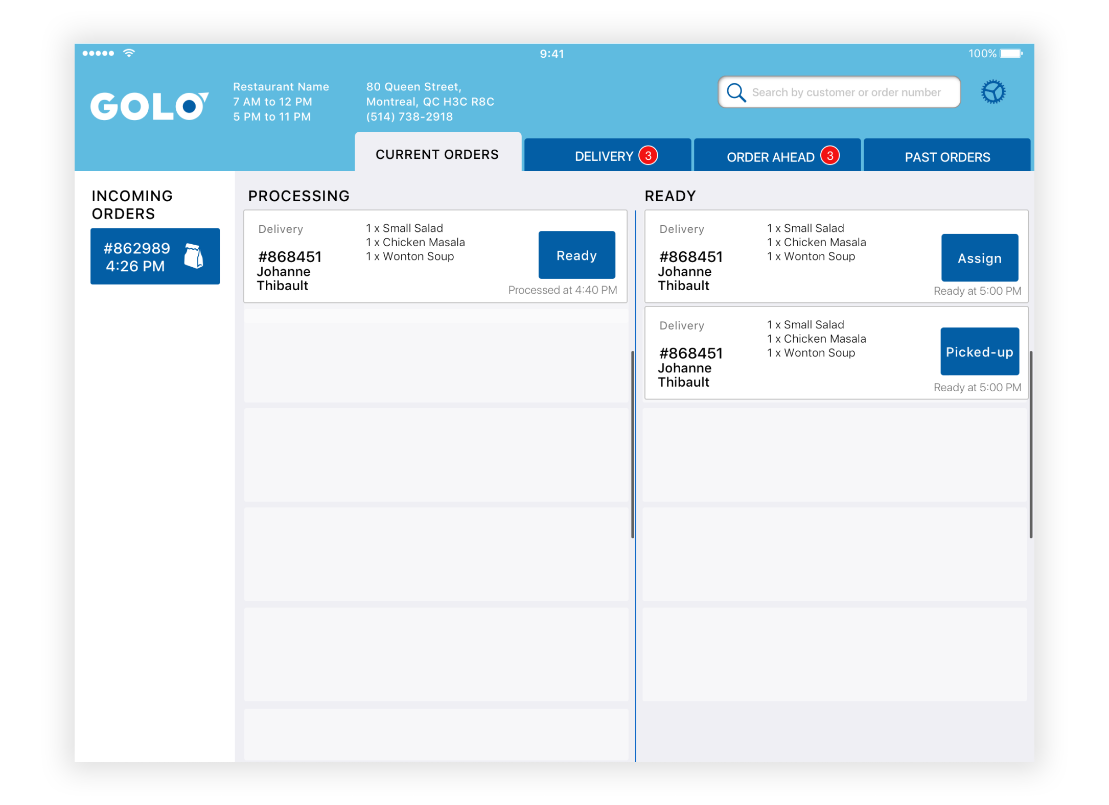
The GOLO project included designing for multiple platforms: a mobile platform for consumers on mobile (iOS and Android), plus two platforms for merchants (a web-based CMS, and a POS tablet app).

Under the Head of Design, my responsibilities were researching customer needs, delivering wireframes for user testing and final interface designs that were handed-off to the developper team.

 
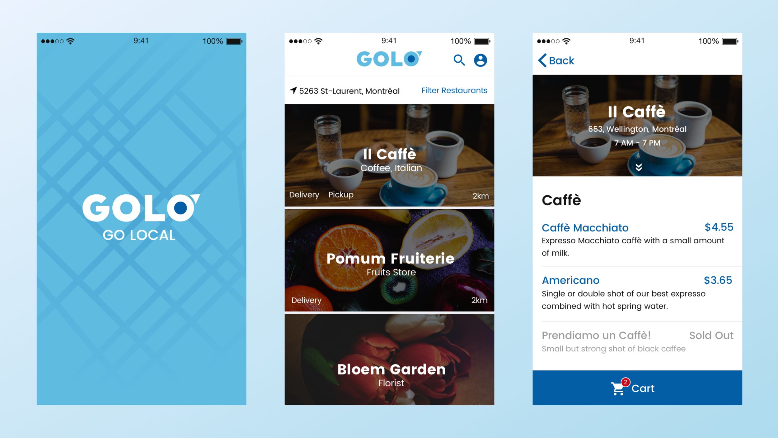
Splash screen, Store list, Item list

Splash screen, Store list, Item list

Designing for multiple platforms: iOS and Android app for end-users, web-based CMS and POS table app for merchants.

 
Responsive-showcase-presentation_Test.png
 
User Flow - Searching an item

User Flow - Searching an item

 
Early UI iteration on the POS app for merchants

Early UI iteration on the POS app for merchants


UX wireframe for developper approval on a delivery screen

UX wireframe for developper approval on a delivery screen


UI iteration #1 before user testing

UI iteration #2 after a user testing

Want to play with the app? You can!
Download it on the App store, or Google Play


Officevibe.
Employee engagement tracker.

Working at GSoft from 2017 to 2019, I worked on Officevibe.

Officevibe is a web-based SaaS that helps managers develop trust and collaboration within their team by sending short, anonymous weekly surveys.

Role: Illustrator, Service Designer and Product Designer
Platform: Web and Slackbot.

 
Artboard3.png
IMG_6282.jpg

During my two years working at GSoft, my role shifted from a Service Designer helping the marketing team to a Product Designer helping the engineering team, building a bridge between both teams.

Under the Head of Design, my role as Product Designer was to research customer needs, deliver wireframes for user testing, plan these user tests, and design the final interface UIs, that would be handed-off to the developer team.

When we knew we had to redesign a part of the product, we would take a step back and make sure the user needs were well understood using the Design Sprint method:


Early iterations of a new metric dashboard

Early iterations of a new metric dashboard

 
What the manager sees

What the manager sees

W

What the employee sees

Curious to learn more about this product?
Visit the Officevibe website